
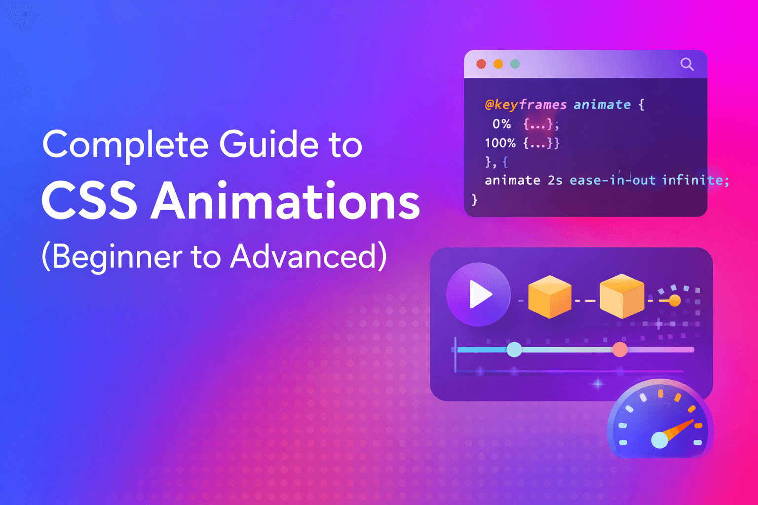
Complete Guide to CSS Animations (Beginner to Advanced)
CSS animations allow you to create smooth, visually engaging effects without JavaScript.
From subtle hover transitions to complex keyframe-based motion, CSS animations are a core
skill for modern front-end developers.
In this complete guide, you’ll learn how CSS animations work, when to use them,
best practices, and real-world examples you can apply directly to your projects.
What Are CSS Animations?
CSS animations let elements gradually change from one style to another over time.
Unlike static styling, animations add motion, feedback, and interaction to user interfaces.
Key Benefits:
- Lightweight and fast – Animations run directly in the browser’s rendering engine
- Native browser support – Works across all modern browsers without polyfills
- No JavaScript required – Pure CSS means fewer dependencies and faster load times
- Easy to maintain – Declarative syntax makes animations simple to update
CSS Animations vs CSS Transitions
Understanding the difference between transitions and animations helps you choose the right tool for each situation.
CSS Transitions
Transitions animate between two states such as hover or focus. They’re best suited for simple UI effects triggered by user interaction.
button {
  background-color: #3498db;
  transition: background-color 0.3s ease;
}

button:hover {
  background-color: #2980b9;
}
Use transitions when:
- You need simple state changes (hover, focus, active)
- Only two states are involved (start and end)
- User interaction triggers the animation
CSS Animations
CSS animations use keyframes and allow multiple animation steps, loops, delays, and direction control. They offer much more flexibility than transitions.
@keyframes fadeIn {
  from { opacity: 0; }
  to { opacity: 1; }
}

.element {
  animation: fadeIn 0.5s ease-in;
}
Use animations when:
- You need complex multi-step sequences
- Animations should play automatically on page load
- You want looping or repeating effects
- You need precise control over timing and direction
Core CSS Animation Properties
To create a CSS animation, you need a @keyframes rule
and animation properties applied to an element.
| Property | Description | Example Values |
|---|---|---|
animation-name | Name of the keyframes | fadeIn, slideUp |
animation-duration | Length of the animation | 0.5s, 300ms |
animation-timing-function | Speed curve | ease, linear, cubic-bezier() |
animation-delay | Delay before start | 0s, 0.2s |
animation-iteration-count | Number of repeats | 1, 3, infinite |
animation-direction | Animation direction | normal, reverse, alternate |
animation-fill-mode | Style before/after animation | none, forwards, backwards, both |
animation-play-state | Pause or run | running, paused |
Shorthand Syntax
Instead of writing multiple properties, use the shorthand:
.element {
  /* animation: name duration timing-function delay iteration-count direction fill-mode; */
  animation: slideUp 0.6s ease-out 0.2s 1 normal forwards;
}
Understanding Animation Timing Functions
Timing functions control the acceleration curve of your animation, making movement feel natural and purposeful.
Built-in Timing Functions
/* Constant speed throughout */
animation-timing-function: linear;

/* Slow start, fast middle, slow end (default) */
animation-timing-function: ease;

/* Slow start, then fast */
animation-timing-function: ease-in;

/* Fast start, then slow */
animation-timing-function: ease-out;

/* Slow start and end */
animation-timing-function: ease-in-out;
Custom Cubic Bezier Curves
For precise control, create custom curves using cubic-bezier():
/* Material Design standard curve */
animation-timing-function: cubic-bezier(0.4, 0.0, 0.2, 1);

/* Bouncy effect */
animation-timing-function: cubic-bezier(0.68, -0.55, 0.265, 1.55);Practical CSS Animation Examples
1. Fade In Animation
Perfect for loading content or revealing elements:
@keyframes fadeIn {
  from {
    opacity: 0;
  }
  to {
    opacity: 1;
  }
}

.fade {
  animation: fadeIn 0.5s ease-in;
}
2. Slide Up Animation
Great for modal entrances and card reveals:
@keyframes slideUp {
  from {
    transform: translateY(30px);
    opacity: 0;
  }
  to {
    transform: translateY(0);
    opacity: 1;
  }
}

.slide-up {
  animation: slideUp 0.6s ease-out forwards;
}
3. Bounce Animation
Eye-catching effect for notifications and buttons:
@keyframes bounce {
  0%, 100% {
    transform: translateY(0);
  }
  50% {
    transform: translateY(-20px);
  }
}

.bounce {
  animation: bounce 1s ease-in-out infinite;
}
4. Pulse Animation
Subtle attention-grabber for important elements:
@keyframes pulse {
  0%, 100% {
    transform: scale(1);
    opacity: 1;
  }
  50% {
    transform: scale(1.05);
    opacity: 0.8;
  }
}

.pulse {
  animation: pulse 2s ease-in-out infinite;
}
5. Rotate Loading Spinner
Classic loading indicator:
@keyframes rotate {
  from {
    transform: rotate(0deg);
  }
  to {
    transform: rotate(360deg);
  }
}

.spinner {
  width: 40px;
  height: 40px;
  border: 4px solid #f3f3f3;
  border-top: 4px solid #3498db;
  border-radius: 50%;
  animation: rotate 1s linear infinite;
}
6. Text Typing Effect
Simulate typing with a clever width animation:
@keyframes typing {
  from {
    width: 0;
  }
  to {
    width: 100%;
  }
}

@keyframes blink {
  50% {
    border-color: transparent;
  }
}

.typewriter {
  overflow: hidden;
  border-right: 2px solid;
  white-space: nowrap;
  animation:
    typing 3.5s steps(40, end),
    blink 0.75s step-end infinite;
}
Advanced Animation Techniques
Chaining Multiple Animations
Combine multiple animations on a single element:
.element {
  animation:
    fadeIn 0.5s ease-in,
    slideUp 0.5s ease-out,
    pulse 2s ease-in-out 0.5s infinite;
}
Using Animation Delays for Staggered Effects
Create sequential animations for lists:
.list-item:nth-child(1) { animation-delay: 0s; }
.list-item:nth-child(2) { animation-delay: 0.1s; }
.list-item:nth-child(3) { animation-delay: 0.2s; }
.list-item:nth-child(4) { animation-delay: 0.3s; }

/* Or use a calculation */
.list-item {
  animation: fadeInUp 0.5s ease-out backwards;
}

.list-item:nth-child(n) {
  animation-delay: calc(0.1s * var(--i));
}
Controlling Animations with JavaScript
Toggle animations programmatically:
.element {
  animation: slideIn 0.5s ease-out forwards;
  animation-play-state: paused;
}

.element.active {
  animation-play-state: running;
}
Performance Best Practices
Creating smooth animations requires understanding what triggers browser reflows and repaints.
Use GPU-Accelerated Properties
These properties are optimized for smooth animation:
/* ✅ GOOD - GPU accelerated */
transform: translateX(100px);
transform: scale(1.2);
transform: rotate(45deg);
opacity: 0.5;

/* ❌ AVOID - Triggers layout recalculation */
width: 200px;
height: 100px;
margin-left: 50px;
top: 100px;
left: 50px;
Enable Hardware Acceleration
Force GPU rendering when needed:
.animated-element {
  transform: translateZ(0);
  /* or */
  will-change: transform;
}will-change as it consumes memory. Apply it only to actively animating elements.Optimize for 60fps
Keep animations at 60 frames per second for smoothness:
- Keep animation duration under 500ms for most UI effects
- Use
transformandopacitywhenever possible - Avoid animating multiple heavy elements simultaneously
- Test on lower-end devices and mobile
Accessibility and Reduced Motion
Always respect users who prefer reduced motion due to vestibular disorders or motion sensitivity.
Respect User Preferences
/* Default animations */
.element {
  animation: slideIn 0.5s ease-out;
}

/* Disable for users who prefer reduced motion */
@media (prefers-reduced-motion: reduce) {
  .element {
    animation: none;
  }

  /* Or provide a gentler alternative */
  .element {
    animation: fadeIn 0.3s ease-in;
  }
}

/* Global disable (use with caution) */
@media (prefers-reduced-motion: reduce) {
  *,
  *::before,
  *::after {
    animation-duration: 0.01ms !important;
    animation-iteration-count: 1 !important;
    transition-duration: 0.01ms !important;
  }
}
Accessibility Checklist
- Never convey information through animation alone
- Provide alternatives for critical animations
- Avoid flashing or rapid movements (seizure risk)
- Keep animations under 5 seconds unless user-controlled
- Allow users to pause, stop, or hide animations
Common CSS Animation Mistakes
1. Overusing Animations
Problem: Too many animations create visual chaos and slow down your site.
Solution: Use animations purposefully. Every animation should enhance usability or provide feedback.
2. Animating Layout Properties
Problem: Animating properties like width, height, or margin causes expensive layout recalculations.
Solution: Use transform: scale() instead of animating dimensions.
/* ❌ BAD */
@keyframes grow {
  from { width: 100px; }
  to { width: 200px; }
}

/* ✅ GOOD */
@keyframes grow {
  from { transform: scale(1); }
  to { transform: scale(2); }
}
3. Ignoring Mobile Performance
Problem: Complex animations drain battery and cause jank on mobile devices.
Solution: Test on real devices, simplify animations for mobile, or disable them entirely.
@media (max-width: 768px) {
  .heavy-animation {
    animation: simple-fade 0.3s ease-in;
  }
}
4. Not Considering Accessibility
Problem: Animations can trigger vestibular disorders or distract users with disabilities.
Solution: Always implement prefers-reduced-motion media queries.
5. Forgetting animation-fill-mode
Problem: Elements snap back to their original state after animation completes.
Solution: Use forwards to maintain the final state:
.element {
  animation: slideIn 0.5s ease-out forwards;
}
Browser Compatibility
CSS animations have excellent browser support. All modern browsers fully support the standard syntax.
For older browsers, use vendor prefixes (though rarely needed today):
@-webkit-keyframes fadeIn {
  from { opacity: 0; }
  to { opacity: 1; }
}

@keyframes fadeIn {
  from { opacity: 0; }
  to { opacity: 1; }
}

.element {
  -webkit-animation: fadeIn 0.5s;
  animation: fadeIn 0.5s;
}
Tools and Resources
Animation Generators
- CSS Keyframe Generator – Quickly create and customize animations
- Animista – Ready-made CSS animations
- Cubic-bezier.com – Timing function visualizer
Animation Libraries
While this guide focuses on vanilla CSS, these libraries offer pre-built animations:
- Animate.css – Popular collection of ready-to-use animations
- AOS (Animate On Scroll) – Scroll-triggered animations
- Motion One – Modern, lightweight animation library
Final Thoughts
CSS animations are a powerful way to enhance user experience when used correctly.
Focus on performance, accessibility, and purposeful motion to create
professional and engaging interfaces.
Key takeaways:
- Choose transitions for simple state changes, animations for complex sequences
- Prioritize
transformandopacityfor smooth, performant animations - Always implement
prefers-reduced-motionfor accessibility - Test on real devices and optimize for mobile
- Use animations purposefully to enhance, not distract from, your content
With these principles and examples in mind, you’re ready to create compelling,
performant CSS animations that delight users while maintaining excellent usability.