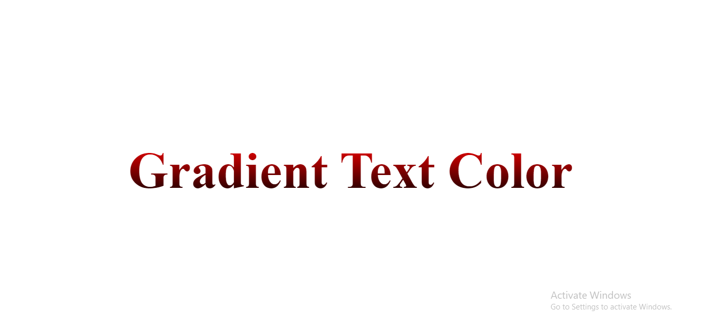
Stylish Text Gradient Effect: Enhance Your Website with CSS Linear Gradient and Text Transparency

Explore our CSS category, where you’ll find loads of helpful articles and tutorials for everyone, whether you’re just starting out or a pro developer. Learn about different CSS styles and techniques that can be applied in various projects according to their specific requirements.
this CSS code is used for styling text with a linear gradient color.
background: linear-gradient(264.41deg, #ECAB76 0%, #B77C4D 100%);
-webkit-background-clip: text;
-webkit-text-fill-color: transparent;
-webkit-background-clip: text;
-webkit-text-fill-color: transparent;
background: linear-gradient(264.41deg, #ECAB76 0%, #B77C4D 100%);
- This line sets the background of an element using a linear gradient.
- The gradient starts at an angle of 264.41 degrees.
- It goes from the color #ECAB76 at 0% (the starting point) to the color #B77C4D at 100% (the ending point).
-webkit-background-clip: text;
- This line sets the background of an element using a linear gradient.
- It specifies that the background should be clipped to the shape of the text.
-webkit-text-fill-color: transparent;
- Another WebKit-specific property.
- It sets the text fill color to transparent, making the text itself transparent.
In summary, this CSS code creates a text element with a background that is a linear gradient going from #ECAB76 to #B77C4D, and the text itself is made transparent, allowing the background to show through the text. Keep in mind that the use of vendor-prefixed properties (-webkit-) is to ensure compatibility with specific browsers.
